
Yanfei (Elfie) Wang
Research: Planned the overall research approach, designed research questions and questionnaires.
V1 design: Responsible for key account, content, and system pages in the first version.
V2 design: Led the transition from the initial version to an optimized, high-contrast experience that specifically addressed the accessibility needs of elderly users.
Gabby Chen
Research: Collected survey responses and conducted face-to-face interviews.
V1 design: Responsible for sign-in and sign-up flows, homepage, reminder, and calendar pages in the first version.
Alzheimer's patients and caregivers struggle with a "usability gap". Existing tools use low-contrast layouts and complex interactions that overwhelm patients, while caregivers lack a centralized way to manage appointments and medical records. My goal was to bridge this gap with a dual-interface system that reduces cognitive load.
To create functional and user-friendly solutions, this design process presented a structured approach to problem-solving.
Why We Started This Project
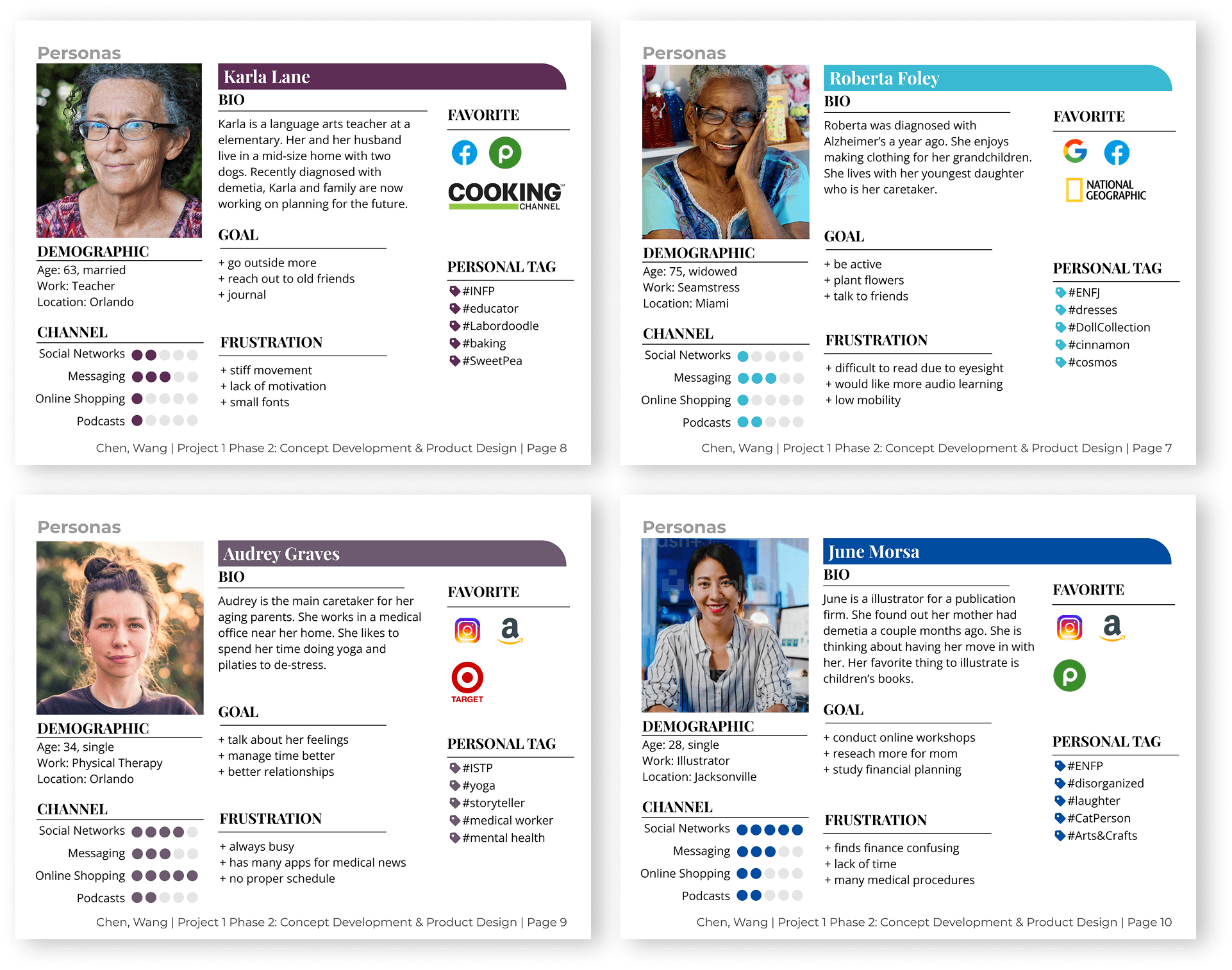
Our research began by identifying a significant "friction point" in Alzheimer’s care - digital tools often create more stress than they alleviate due to confusing layouts and high cognitive load. To understand the specific needs of our dual-audience, we conducted a multi-method study involving questionnaires, interviews, and a deep dive into reports from the Alzheimer’s Association.
Who We Identified as Our Target Users
As we moved into user research, we realized that the needs we were studying belonged to more than one group. While patients and caregivers interact closely, their digital requirements are vastly different. Patients prioritize calming, simple interfaces for brain-training games, while caregivers require high-functioning organizational tools to manage medical records and appointment schedules. This insight became the foundation of our design strategy - a single app that serves two distinct experiences.


Users don't know what kind of games are suitable to Alzheimer's.
Caregivers are required to help manage medical records or appointment due to forgetfulness of patients.
Two groups of users seek diverse features while interacting with the same app.
Some interfaces are not easily accessible to elder users.
Patient's Concern
Accessibility (+ Functionality)
Caregiver's Concern
Functionality
User flows


Wireframes
We structured the app pages by a clear hierarchy and main features, distinguishing among login, reminder, game gallery, account and setting pages. This organization enables us to prioritize content and guide user engagement effectively.

Initial Comps (V1)
Initial UI focused on a soft, calming aesthetic for Alzheimer's patients.


To validate our design, I conducted high-fidelity usability testing with a representative sample of over 10 participants, including family caregivers, healthcare professionals, and nursing students. We measured success through three key metrics: Ease of Use, Error Rates, and Overall Satisfaction.
Challenge
While our initial UI was aesthetically harmonious, testing revealed a critical failure that the soft color palette lacked the visual contrast necessary for elderly users to navigate intuitively. Furthermore, we discovered a "barrier to entry" - the default font sizes were too small, and our target demographic struggled to find or use the manual accessibility settings.
Solution
I led the design iteration to prioritize inclusive defaults. I overhauled the color system to include high-contrast, "eye-catching" colors that better-guided user attention and aided memory retention. I also eliminated manual friction by setting larger font sizes and touch targets as the global default, ensuring the app was usable "out of the box" for patients with varying degrees of cognitive and visual impairment.
Feedback
The colors are harmonious, but there is no contrast. Bright colors can attract the attention of older people and help them remember.
Optimize
Unify the design style, add eye-catching colors to better guide users through the app's functions.

Feedback
The default font is still too small for the elder, and the elder are not good at resetting software.
Optimize
Taking more account of elder's vision problem, adjust the default visual size of the app to large size.

Feedback
Light purple background and white text are too difficult to read, especially for elder users.
Optimize
Increased contrast between background and text.

Separate admin
Patient account & caretaker account (Most of Alzheimer patients need caretakers to help manage the daily life)
Brain training games
Game gallery helps Alzheimer patients train their brain to alleviate the issue of memory loss.
Reminder & calendar
Users can add/modify the reminders through clicking Alarm icon in the navigation bar.
Featured function
For users with limited vision, app provides font-size adjustment and dark mode.
The final iteration of this app design successfully bridged the usability gap between Alzheimer’s patients and their caregivers. Over the 16-week timeframe, we transformed a complex healthcare challenge into a streamlined, dual-interface solution that prioritizes cognitive ease and accessibility.
Reduced Cognitive Load for Patients: By categorizing brain games into simple groups with short descriptions, we created an environment where patients could engage in memory training without feeling overwhelmed.
Empowered Caregivers: Double accesses for different user groups + the implementation of centralized tools reduced the "friction" caregivers face in help patients manage daily health tasks.
Inclusive Design Excellence: Through rigorous testing with representative users, we moved beyond aesthetics to implement high-contrast layouts and large-scale typography that worked by default for elderly users.
My Leadership & Growth
In my role as the UI/UX Designer, I was responsible for the architectural integrity of the core system and led the cross-page experience refinement. This project reinforced a critical UX lesson: Harmonious design does not always equal accessible design. My primary contribution was ensuring that our visual optimizations, such as eye-catching colors and guided navigation, were directly informed by user struggle, ultimately resulting in a more comfortable and inclusive product.