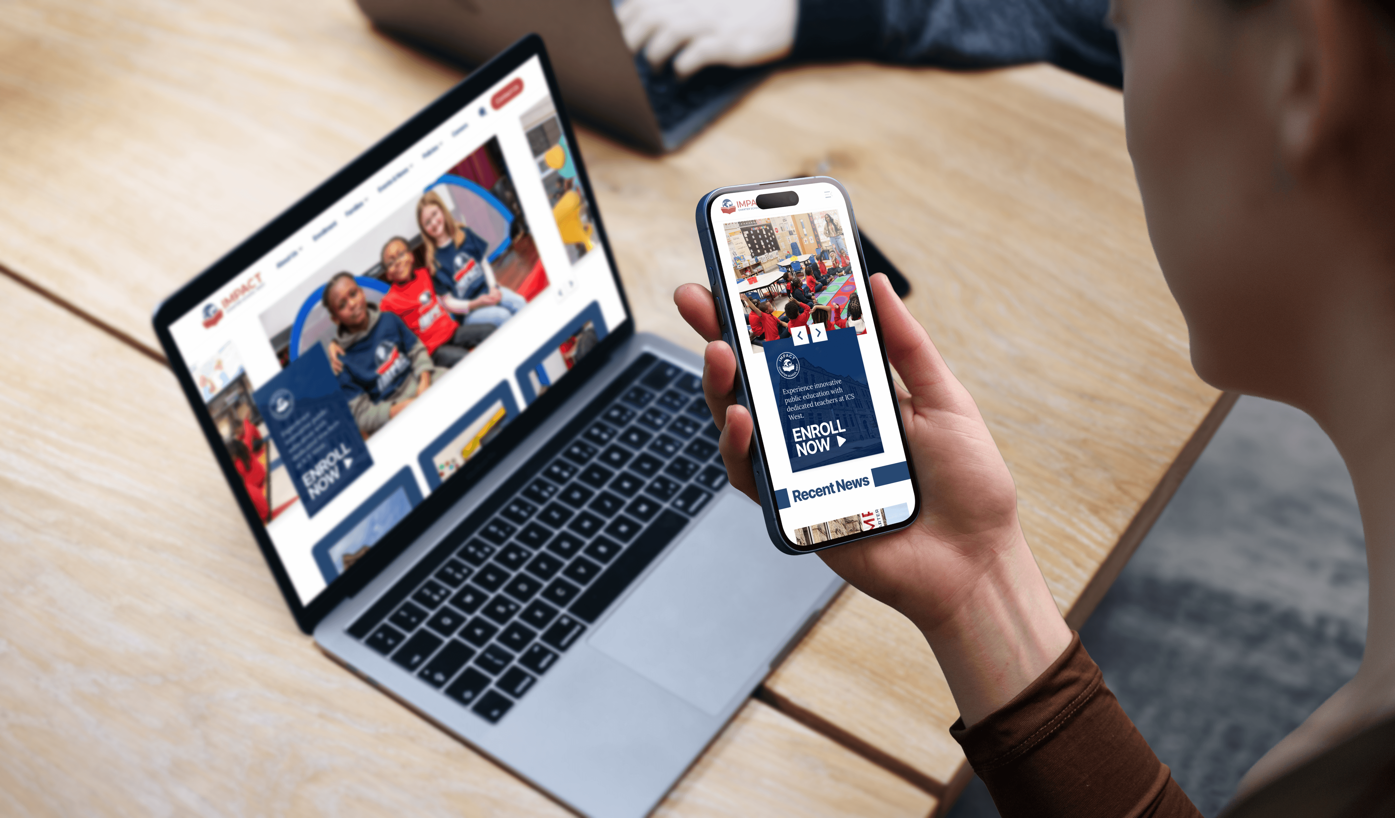
This project involved 5 workflow sections, from problem identification to final implementation.
Problem Statement
The original website provided limited guidance for users, particularly on the homepage, where important information and pathways to key pages were not clearly surfaced. Most pages relied heavily on text with minimal visual hierarchy or lacked clear entry points, making content difficult to scan and reducing overall engagement. As a result, parents and prospective families had to spend more effort locating important information such as enrollment details, family resources, and school updates.


Approach
To address these challenges, I focused on improving information structure and page clarity, establishing clearer content hierarchy, introducing stronger navigation pathways, and applying the updated visual identity across key parent-facing pages.
Page Improvement
I worked with the ICS West team to define the purpose of each key page, including Home, Enrollment, Family Resources, and News & Events. Content was reorganized to establish clearer hierarchy, improve scanability, and ensure that information was presented where families would expect to find it. Key actions and resources were surfaced throughout the experience, helping parents access important information more efficiently.
Homepage
Challenge
The homepage provided limited guidance to key content and lacked visibility into ongoing school activities and updates.
Improvement
Added a dedicated News & Updates section
Increased visibility of key resources and enrollment information
Established a clearer content hierarchy
Enrollment
Challenge
Enrollment information was presented in dense content blocks, making the process difficult to scan and understand
Improvement
Reorganized content into clear sections
Structured key actions and supporting information around the enrollment journey
Family Resources
Challenge
Resource information was displayed as a simple list of title-only links, making it difficult for parents to identify relevant support services at a glance.
Improvement
Organized resources into meaningful categories
Added supporting descriptions to provide context
Improved visual hierarchy and scanability
News & Events
Challenge
Parents could easily overlook important school updates because article previews provided limited context, while lengthy text-heavy pages made detailed content difficult to read.
Improvement
Introduced richer content previews to better highlight each update
Separated content types and organized content into more digestible sections
Enhanced readability through clearer spacing and content structure
Improved visual hierarchy across article pages
Brand Alignment
I helped the school introduce updated brand guidelines to create a more consistent and recognizable identity across all touchpoints. By translating the new brand guidelines into a reusable visual system, the redesign created a more readable, and trustworthy experience for parents and prospective families.

Responsive Experience


AI-Assisted Workflow
AI tools were used to support content restructuring and early design exploration throughout the project.
How AI was used
Why it was used
Improve clarity of dense informational content
Speed up iteration of content restructuring
Translate brand guidelines into a cohesive web UI for brand consistency
Ensure usability and alignment with the school's brand guidelines
Content Audit
AI-assisted Analysis & Exploration
Content & Design Refinement
Final Experience
Outcome
Content Clarity
Information is easier to scan and understand.
Resource Discoverability
Key resources are easier to locate.
Brand Consistency
Information is easier to scan and understand.
User Experience
Families can access information with greater confidence.
This project reinforced the value of content-first design. Small changes in content organization and hierarchy can significantly improve how users navigate and consume information, even without major changes to site navigation or functionality.